How to Describe Your Website Vision to a Designer
You know you want your website to feel different.
Maybe you want it to be minimalist. Modern. Warm. Bold. Editorial. A little edgy.
The problem?
Those words can mean completely different things depending on who you ask.
As a website designer, I work with plenty of clients who have somewhat of an idea of what they want their website to look like. They may know the colors they like or have a specific font in mind, but explaining the overall vision is where things start to get a little fuzzy.
And that’s okay.
You don’t need to know website design terminology to explain your vision to a designer. But you do need to give us enough clues to understand what you’re seeing in your head.
Here’s how to do that.
Show Your Website Designer Instead of Just Telling Them
If you tell me you want a “minimalist website,” my first question is probably going to be: What does minimalist mean to you?
Because one person’s idea of minimalist is a stark black-and-white website with lots of whitespace.
Someone else may picture warm creams, beige, earthy colors, and soft typography.
Neither person is wrong.
This is why I always ask my clients to create some form of visual mood board. I typically use Pinterest, but if Pinterest isn’t your thing, saving images from Google works too.
The goal is to give me a visual representation of what you’re naturally attracted to.
And here’s the important part: you don’t have to only save websites.
Actually, I would encourage you not to.
Save clothing you love.
Interior design.
Artwork.
Photography.
Colors.
Packaging.
Magazine layouts.
Anything that makes you think, Yes. This feels like me.
As a designer, I can look at those visual patterns and start connecting the dots.
Maybe you’re constantly saving spaces with warm wood, soft natural light, and muted colors. That tells me something.
Maybe everything you choose has bold typography, high contrast, and a little retro influence. That tells me something too.
Your website vision doesn’t always start with another website.
Be Careful With Words Like “Minimalist,” “Luxury,” or “Modern”
Broad design words are helpful as a starting point, but they shouldn’t be the entire creative direction.
I’ve learned over the years that everyone’s perception of a style is different.
If you tell your designer you want something modern, show them what modern looks like to you.
The same applies to words like:
Minimalist
Feminine
Bold
Luxury
Professional
Edgy
Organic
Fun
Visual examples help remove some of the guesswork.
You don’t need to explain why you like every image either. Sometimes you may not know.
That’s part of my job.
I can look at everything you’ve collected and start identifying the common colors, shapes, moods, and visual styles showing up again and again.
But your designer should also confirm that they’re interpreting those clues correctly before disappearing into the design cave and building your entire website.
Your First Mood Board Might Not Actually Be Your Vision
Here’s a perfect example.
I once worked with a client who described her style as very rock and roll.
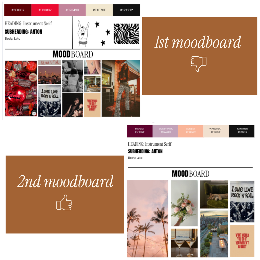
Her original Pinterest board leaned heavily into an ’80s rock band vibe. There were lots of reds, bold colors, and visual references that reminded me of bands like KISS.
So, naturally, I used those references to start developing the visual direction.
And it ended up not being what she envisioned.
Plot twist: she didn’t like red, but a lot of her Pinterest board had red elements.
Instead of forcing the original direction, we went back and looked at her vision differently.
I asked her to think beyond music.
What other things did she like?
What places, styles, colors, and visuals felt like her?
The second mood board was completely different.
We started seeing sunset colors, Hollywood, Sunset Boulevard, beach influences, romantic vibes, dusty blues, mauves, pinks, and creams. Honestly, it was stunning.
It still had personality. It still felt cool. But it was a much better representation of her than the original rock-and-roll interpretation.
That’s why I don’t treat a mood board as a set of design commandments carved into stone.
It’s a communication tool.
I review what my clients give me, create a visual direction based on what I’m seeing, and make sure we’re on the same page before moving further into the website design.
Sometimes you need to see your vision reflected back to you before you realize, “Nope. That’s actually not what I meant.”
And that’s valuable information too.
Think About Who Your Website Needs to Attract
Your website should absolutely have your personality in it.
I strongly believe that’s one of the things that can make your business stand out, especially when there are dozens of other businesses offering something similar.
But your website isn’t only about you.
It’s also about the person landing on it.
When I’m developing a website’s visual direction, I’m usually thinking about two things at the same time:
What feels authentic to the business owner?
And…
What is going to connect with the audience they’re trying to attract?
The sweet spot is somewhere in the middle.
You don’t want to copy another business because you think their website is successful. Their business may have a completely different personality, audience, and strategy.
Instead, think about what makes your business feel different.
Then consider the type of person you want landing on your website.
What are they attracted to?
What will make them feel comfortable?
What will make them trust you?
What will make them think, This is exactly what I’ve been looking for?
Good website design brings those pieces together.
Please Think About Your Website Photos Too
I say this with love.
You probably do not need a headshot of yourself on every single page of your website.
Before becoming a website designer, I worked as a photographer, and that background has heavily influenced the way I approach websites.
I’m always thinking about the overall visual story.
Your website photography should help tell the story of your business. That doesn’t always mean another photo of you smiling at the camera in a slightly different pose.
Think about the details surrounding your business.
Your workspace.
Your process.
The tools you use.
The environment your clients experience.
Objects, places, and imagery that connect to the feeling of your brand.
Sometimes the most effective website image doesn’t include the business owner at all.
Professional brand photography is always ideal when it’s available. iPhone photos aren’t automatically bad, but the quality and consistency of your images can have a major impact on how professional your website feels.
When my clients don’t have enough photography, I often use my photography background to source the right stock imagery or create high-quality AI imagery that works alongside the photos they already have.
I’m not just filling an empty image block.
I’m thinking, What does the story need here?
That’s a very different approach.
Don’t Only Describe How You Want Your Website to Look
Your website vision should also include what you need the website to do.
What’s the ultimate goal?
Do you want people to book a service?
Contact you?
Register for an event?
Browse a directory?
Learn about your programs?
Purchase something?
The purpose of the website affects the design and the functionality you need.
I’ve worked on projects where a client wanted a specific feature that the website platform couldn’t handle natively. In those situations, my job isn’t simply to say, “Nope, can’t do it.”
I look at what the client is actually trying to accomplish and figure out another way to get there.
Sometimes that means bringing in another tool or integrating a different platform.
It also means educating the client on why I’m recommending that solution and how it supports their business.
You don’t need to come to your website designer knowing the exact plugin, integration, or technical setup you need.
Tell us the goal.
A good designer should be able to help you figure out the path.
Make Sure the Vision You’re Sharing Is Still Current
If you already have brand guidelines or a mood board, you’re definitely ahead of the game.
But I still like to clarify the direction with my clients.
Because sometimes you created that Pinterest board six months ago and your taste has shifted.
Or you liked a certain style when you started your business, but now your business has grown into something different.
Before your designer starts working, take another look at the visual references you’re providing.
Do they still feel like you?
Do they represent where your business is going?
One of my functional health clients came to me because she had originally built her website herself. Her business had grown, her services were evolving, and she was beginning to build more of a team.
Her old website and branding no longer reflected the business she was creating.
Her previous branding used a lot of black and brown and was very dark, but as we worked through her new visual direction, the brand completely transformed.
We moved into earthy greens, creams, browns, and grounded colors that connected much more naturally to the functional health direction of her business.
I also created organic illustrations throughout the website to add personality and visual storytelling without making the brand feel clinical.
We wanted people to feel taken care of.
We wanted the brand to feel holistic and grounded.
But it still needed to feel professional and capable of supporting a growing team.
I ended up working on both her branding and website, and the final direction felt much more aligned with the business she had grown into.
That’s the difference between designing for where your business was and designing for where it’s going.
The Best Way to Describe Your Website Vision? Give Your Designer Clues
You don’t need to show up to your website project with a perfectly written creative brief.
You don’t need to know the difference between serif and sans serif fonts.
And you definitely don’t need to start casually throwing around design terminology you found on TikTok five minutes ago.
What you do need is a willingness to show your designer what you’re drawn to.
Create a mood board.
Look beyond websites.
Pay attention to colors, clothing, interiors, art, photography, and places that feel like you.
Think about your audience.
Think about the story your photos are telling.
And most importantly, stay true to your own business instead of trying to recreate someone else’s.
There may be ten businesses offering a service similar to yours.
Your personality, perspective, story, and the way you connect with your audience are what give your business its own identity.
Your website designer’s job is to take all of those scattered visual clues and turn them into something cohesive, strategic, and unmistakably connected to your business.
Sometimes it’s easier to show us what you mean than to explain it.
Trust me. We can work with that.
Have a Website Vision You’re Struggling to Explain?
You don’t need to have every color, font, or design detail figured out before working with a website designer. That’s part of the process.
With my Strategic Website Design service, I help you take the ideas, inspiration, and vision floating around in your head and turn them into a strategic website that feels like your business and connects with the people you want to reach.
Ready to turn your website vision into something real?